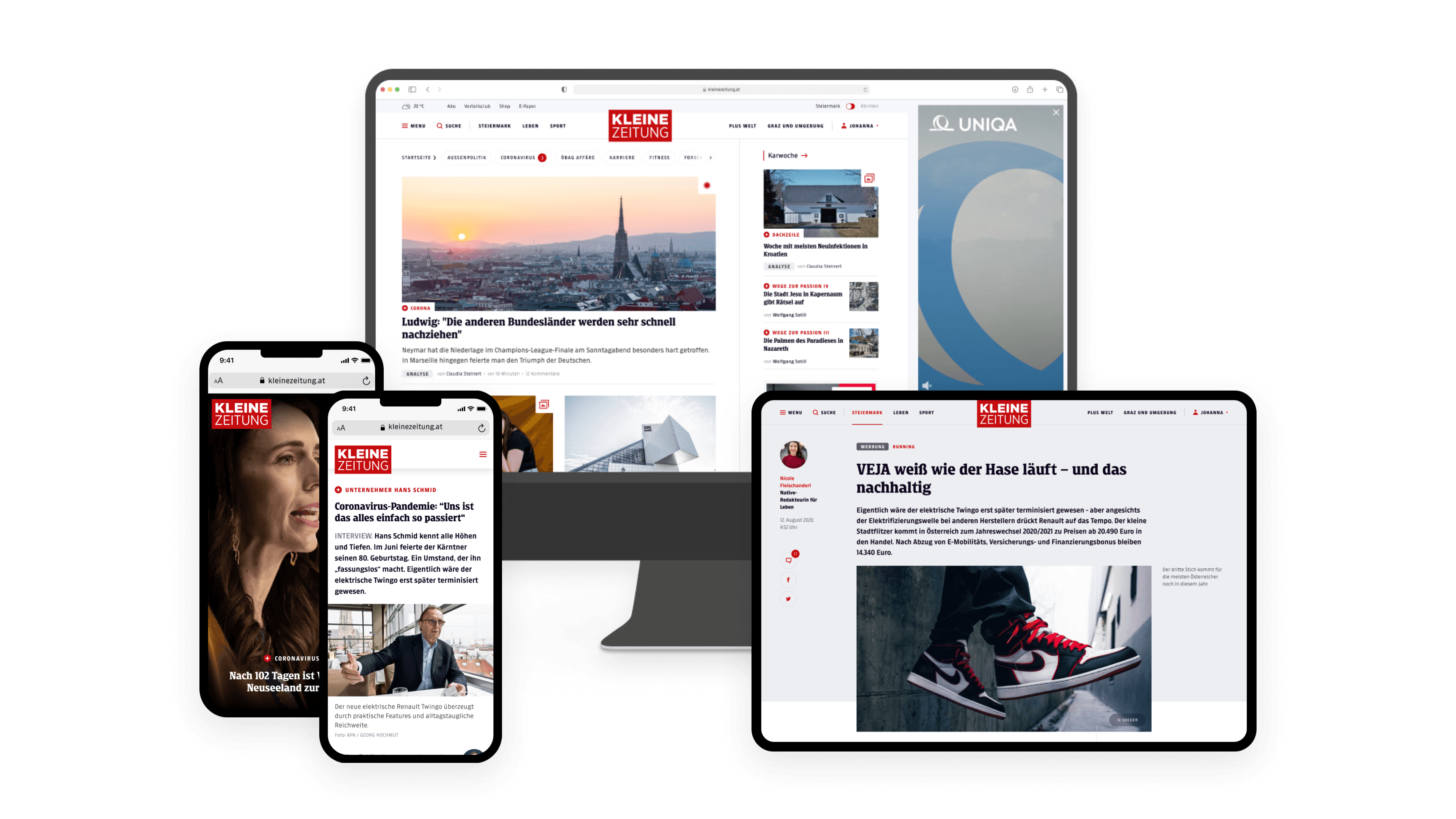
As part of the comprehensive relaunch of Kleine Zeitung's digital platforms, I led the development of a scalable design system in Figma. For the first time in the newspaper's 120-year history, this system provided a unified visual language across the newspaper's digital presence, ensuring consistency and alignment across all departments.

Context
In the rapidly evolving digital landscape, Kleine Zeitung needed a cohesive and scalable design system to maintain a consistent visual identity across all its digital platforms. This project aimed to establish a unified approach that could be easily adopted by different departments, ensuring that the newspaper's brand and digital presence remained consistent and modern.
Background
As the lead Product Designer, I was responsible for creating a comprehensive design system for Kleine Zeitung. This initiative was part of a broader platform relaunch, executed by a dedicated task force. Building on the visual identity and initial UI elements developed by the renowned Berlin-based agency EdenSpiekermann, I expanded these foundations into a robust design system that could be utilized across all digital platforms, including the website, mobile app, and ePaper.
Process
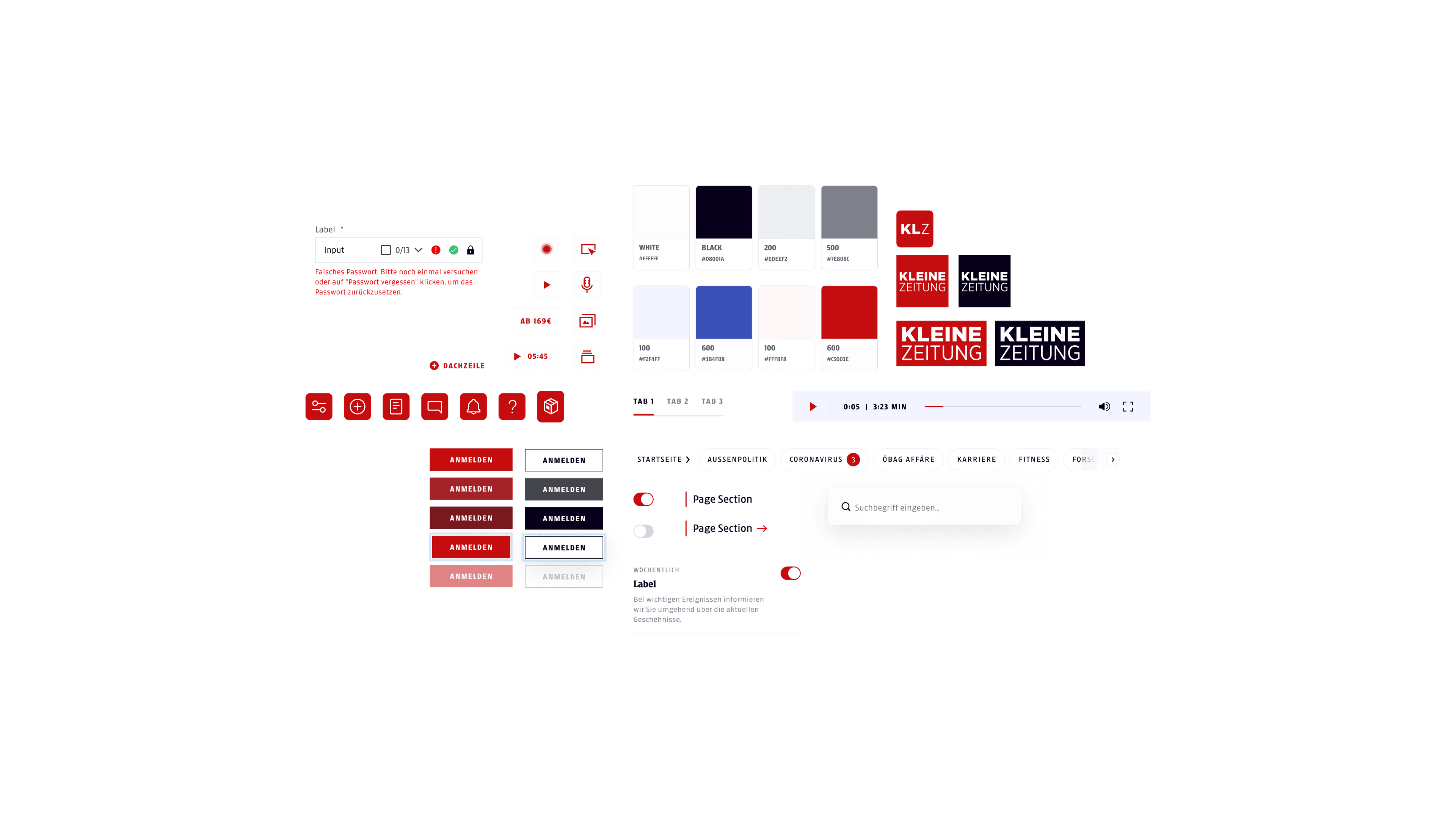
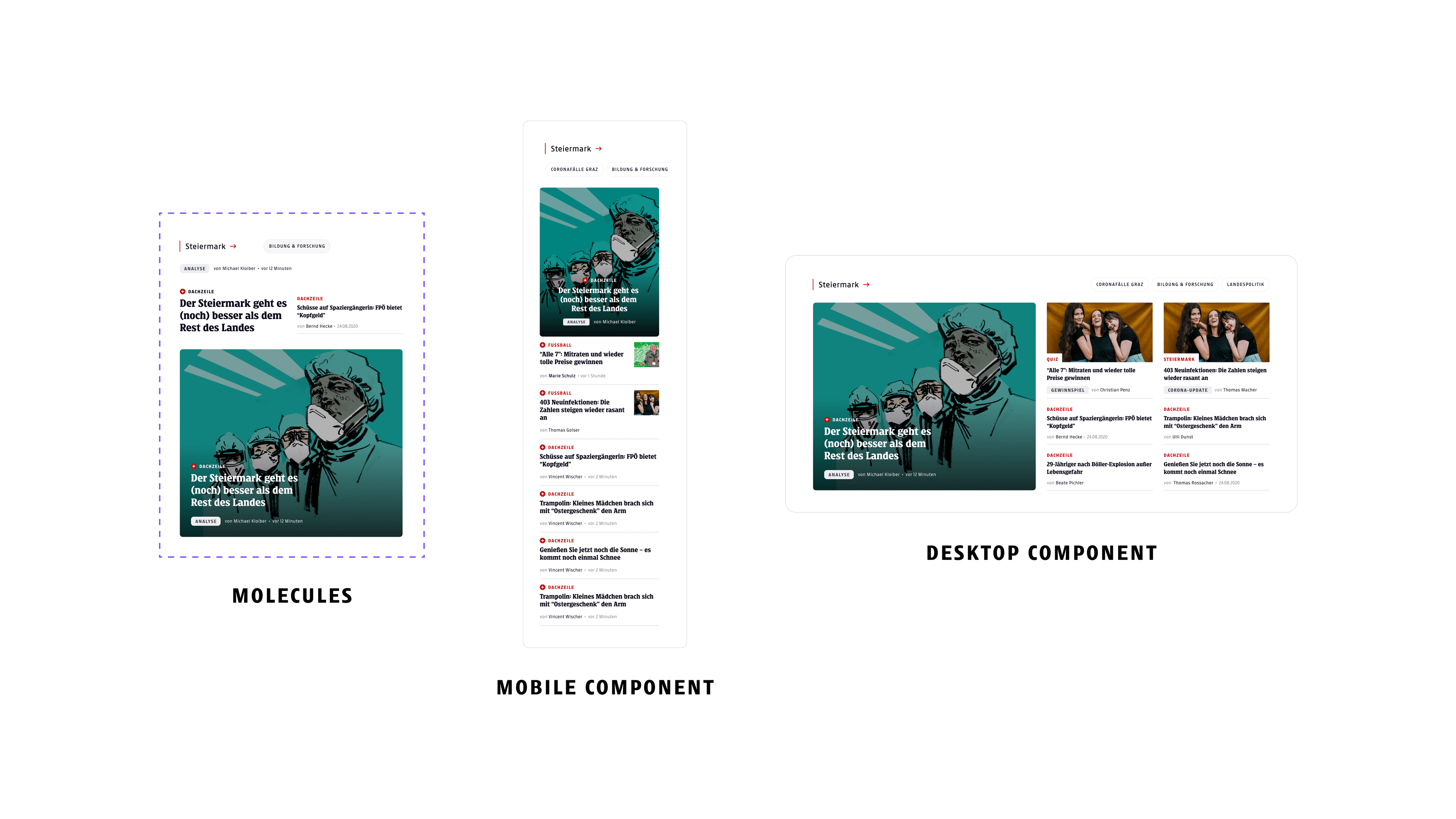
Following the Atomic Design methodology, the design system was developed in Figma, starting with the creation of fundamental elements known as "atoms." These atoms included the core visual assets like color palettes, typography styles, and iconography. From these basic building blocks, more complex components, or "molecules," were assembled, such as buttons, form fields, and navigation elements. These "componenets" representing more complex UI structures like headers, footers, and content blocks.

Taking inspiration from the Atomic Design methodology, I've build a comprehensive design system for Kleine Zeitung in Figma
This modular approach ensured that the design system was flexible and scalable, allowing for easy updates and additions without disrupting the overall coherence. Regular consultations and feedback sessions with chosen „Design Partners" from each department helped tailor the design system to specific needs while maintaining a unified visual language. These partners were granted write access to their respective department's design files but were restricted from altering core primitives, which were managed exclusively by me.
Solution
The outcome was a set of Figma files for each platform, interconnected through a shared library of atomic elements, molecules, and components. This setup allowed for consistent styling across the app, website, and ePaper, with a single source of truth for all UI elements. The design system not only facilitated a consistent brand experience but also empowered department-specific designers to create visual assets aligned with Kleine Zeitung's identity.
The design system included clear guidelines and documentation, ensuring that all stakeholders had a comprehensive understanding of the brand's visual standards. Regular meetings with these Design Partners allowed for iterative improvements and the inclusion of new requirements as they emerged.

Taking inspiration from the Atomic Design methodology, we've build a comprehensive design system for Kleine Zeitung in Figma
Impact
For the first time in the company's 120-year history, there was a documented and shared understanding and application of a unified visual identity across all digital channels. The design system provided a solid foundation for visual consistency, from color values and typography to padding and button styles.
This significantly strengthened Kleine Zeitung's brand identity and gave internal teams and external partners the confidence to explore creative expressions within a well-defined framework.
Reflection
The project was a milestone in my career, not only as a designer but also in my role as a manager – responsible for process management and quality assurance. I delved deeply into design system best practices, drawing inspiration from industry leaders like Uber, Airbnb, and Mailchimp. The process involved conducting various internal interviews to gather diverse perspectives and ensure the design system met the needs of all stakeholders.
The success of the design system, which continues to be used by the company, is a testament to the thorough planning and collaborative effort put into its creation. This experience has equipped me with valuable insights into managing large-scale design projects and fostering a cohesive brand identity across diverse platforms.
