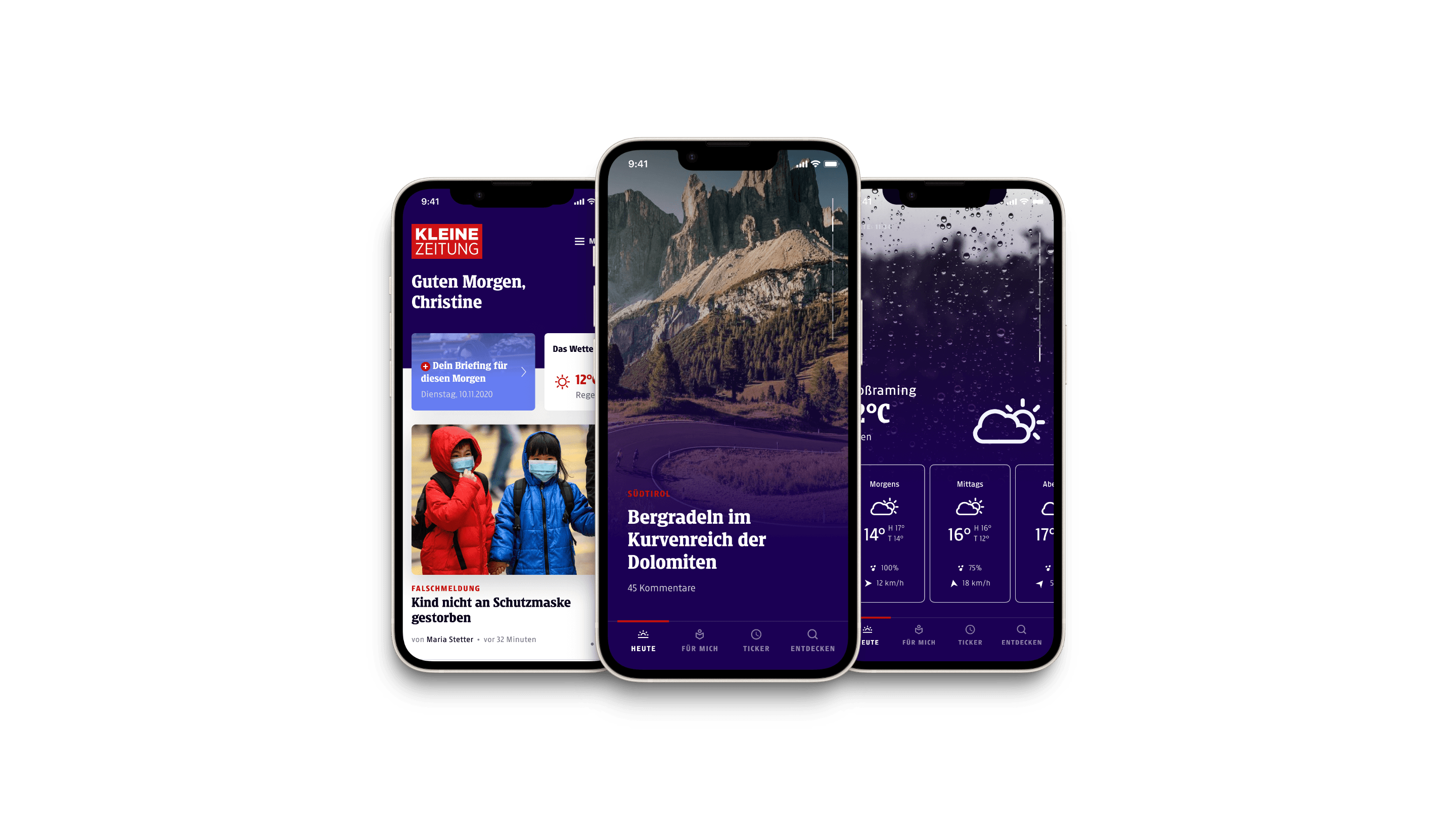
When we did the Platform Relaunch of Kleine Zeitung, we not only did a complete Redesign of the Website & the ePaper, but also ideated a new Smartphone app from the ground up. We utilized behavioral psychology and state-of-the-art user experience to create a unique habit-forming news app.

Context
Traditional media, including the Kleine Zeitung, face a constant battle for the attention of their readers. We asked ourselves how might we replicate the reading habit traditionally achieved through the daily ritual of reading print editions in a digital format?
Our goal was to create a digital habit that would make the app an indispensable part of the user's daily routine, significantly increasing the number of registered users and digital subscriptions.
Background
As the lead Product Designer, I led the UX and Interface Design of the app relaunch in 2022. The core feature of the app, Heute, was a short news feed presenting five stories that users could swipe through, emulating the addictive user experience of popular social media platforms like YouTube, TikTok, and Instagram.
Our objective was to integrate habit-forming UX principles to boost user engagement and retention.
Process
We started off with idea sketches provided by the renowned Berlin-based firm EdenSpiekermann as part of a visual rebranding.
I utilized EdenSpiekermann's ideas to lay the groundwork for the new section, conducted multiple user interviews to analyze reading behaviors, and analyzed existing app usage metrics to identify key areas for improvement.

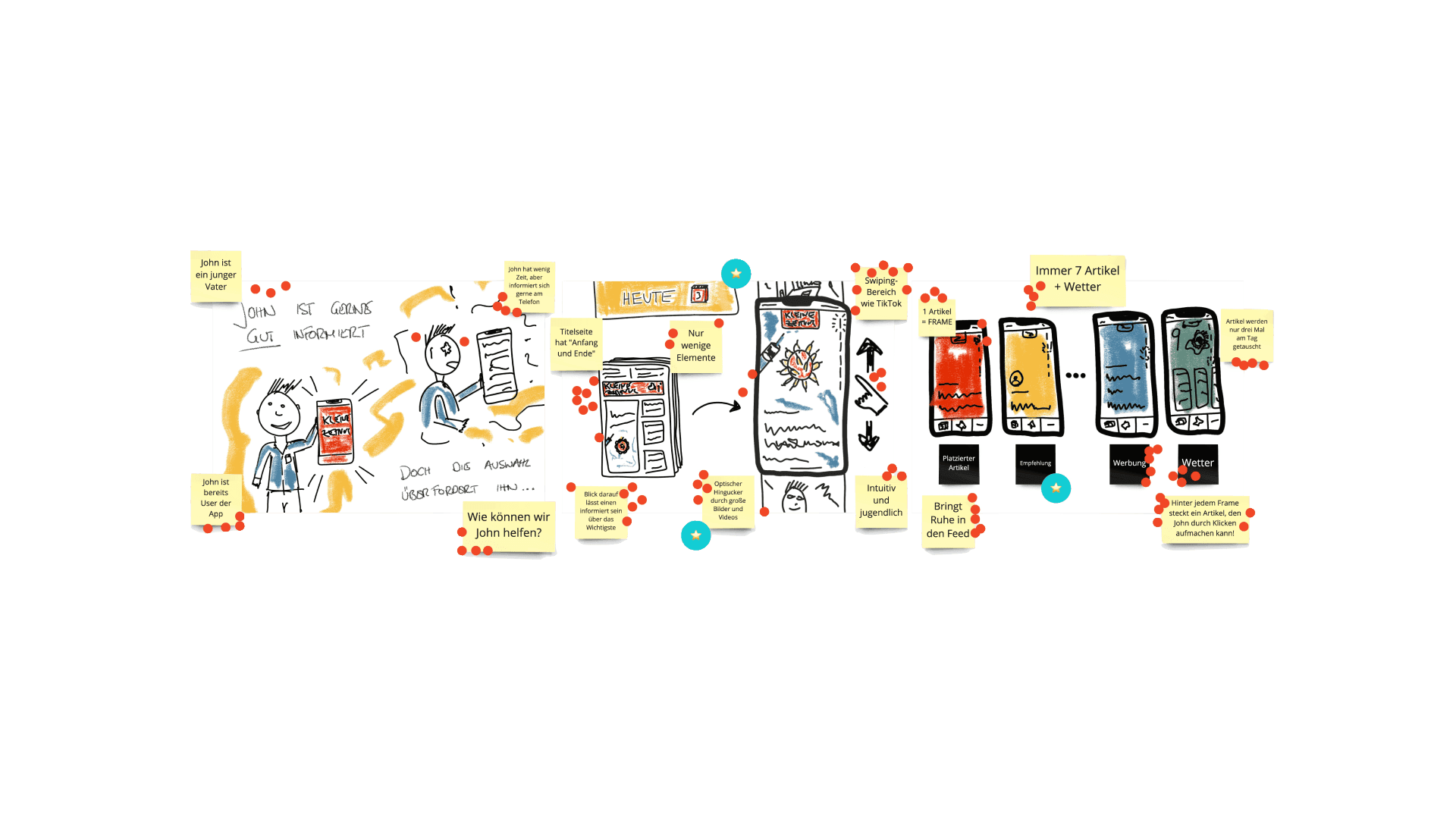
Sketches from the initial Design Sprint workshop
To map out the idea, we conducted a Design Sprint with the project team to map out the basic structure and flow of the app. This stage focused on layout, navigation, and user interaction patterns. It was the first touchpoint for the editorial department to map out the content strategy for the new section. The wireframes were iteratively refined based on feedback from Thinking Aloud testings with our test group group and feedback from internal stakeholders.
Building on the wireframes, I developed high-fidelity mockups that incorporated the visual identity established by EdenSpiekermann. The interface design emphasized a clean and modern aesthetic, using bold typography, engaging imagery, and intuitive interactions to create a visually appealing and user-friendly experience.
I created prototypes to simulate the user experience and test the app’s functionality. These prototypes were essential for gathering additional feedback from users, allowing us to identify and address potential usability issues early, before even starting the development process.

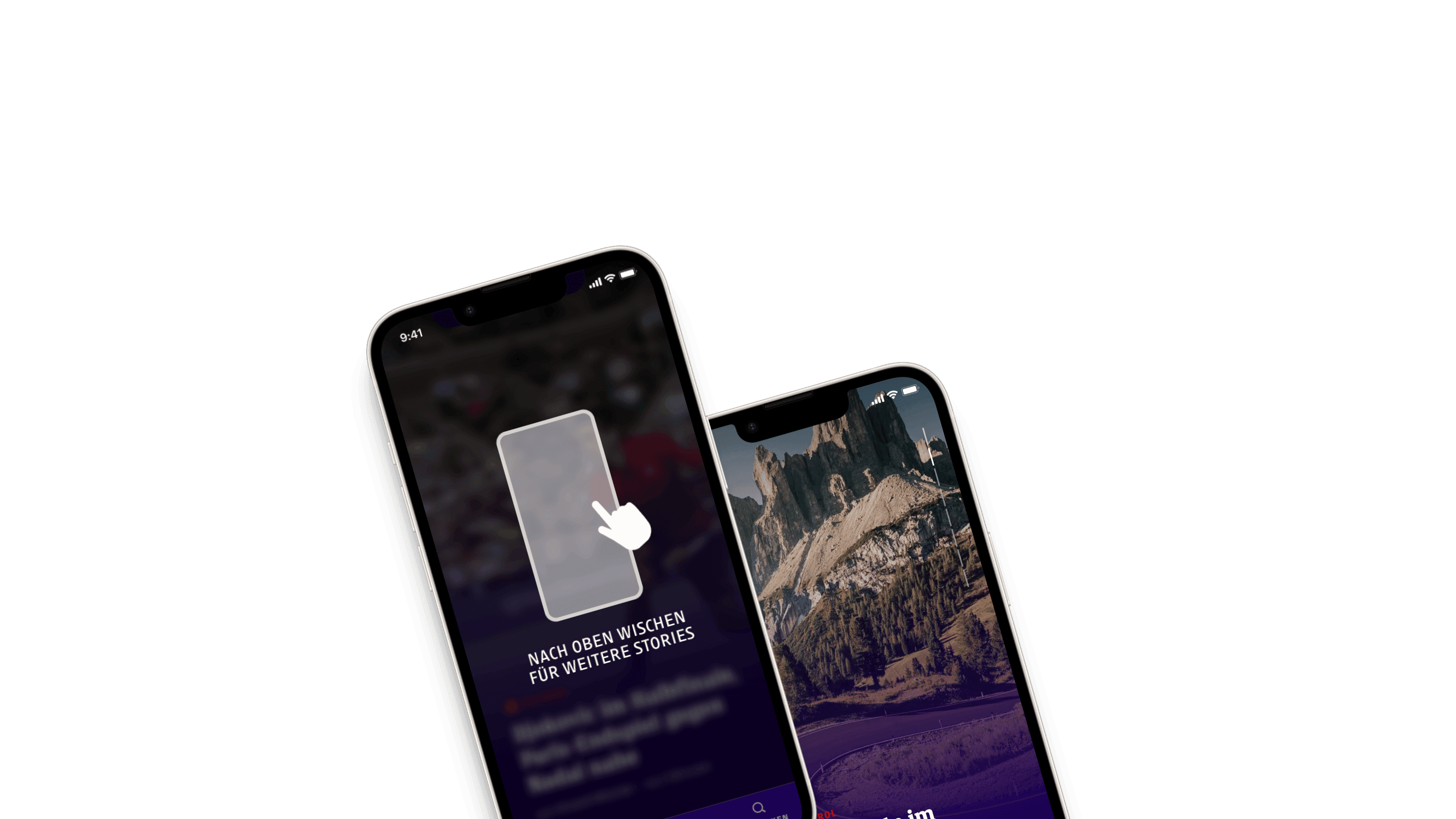
Learning from peer applications, we provided minimal guidance to the user
To ship the feature, I collaborated closely with an external development studio and conducted comprehensive QA testing to ensure the final product met our high standards for user experience.
Solution
The Heute section of the app was developed to establish a sense of routine and reliability for users. The UX of the new section was heavily inspired by its peer applications to build upon the already established muscle memory of new users. By aligning the mechanics and aesthetics with internationally renowned apps like TikTok and Instagram, we aimed to create a familiar yet unique experience for Kleine Zeitung readers.

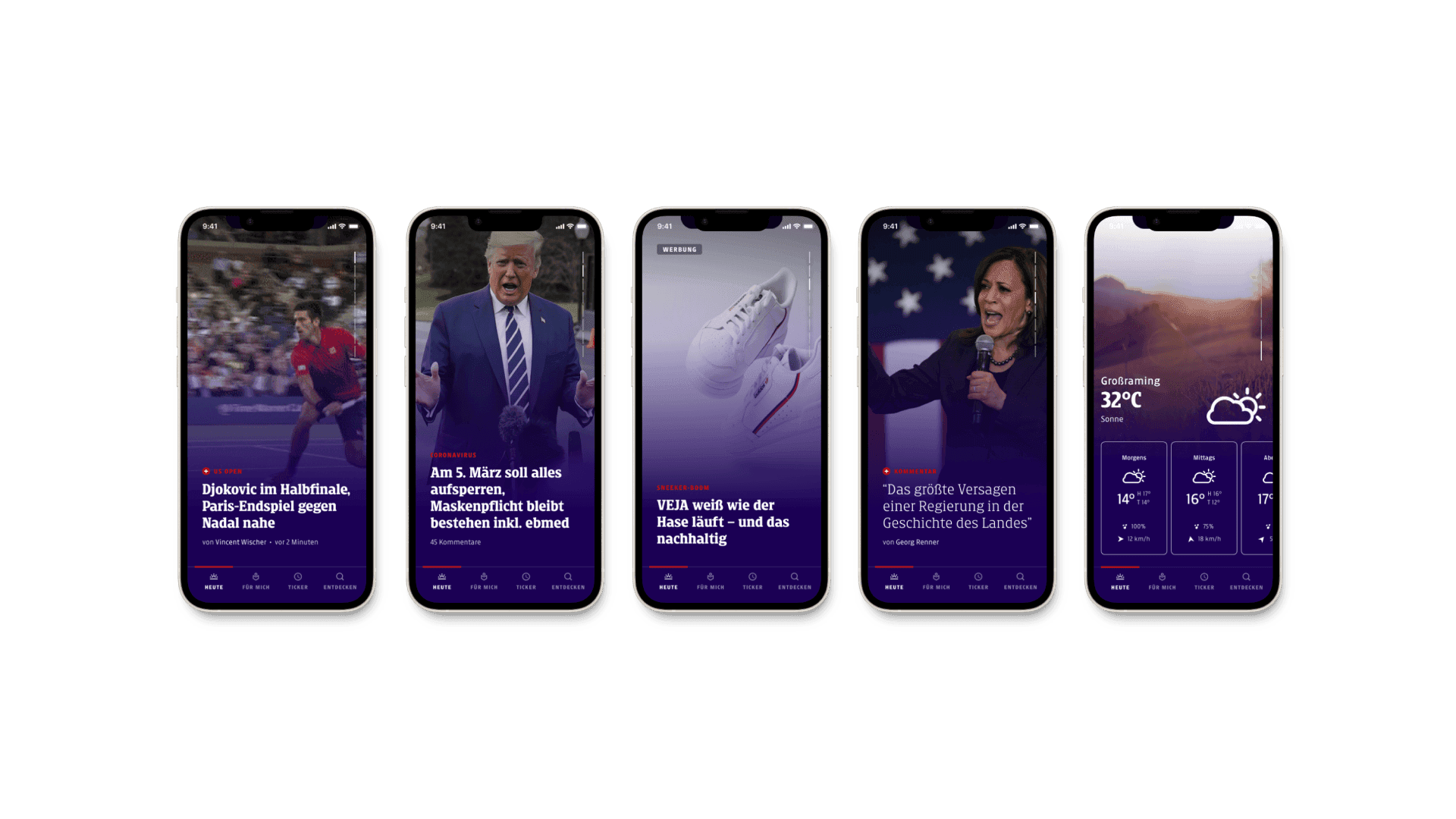
The final product featured 5 news stories, one advertorial and the weather forecast
Impact
The new app section with a combination of curated content and an engaging interface resulted in a habit-forming news consumption pattern among users, which outperformed traditional news feeds from the past.
Creating a feed with artificial scarcity (7 stories at the same time, 21 stories per day) also initiated a new way of thinking in the editorial department. We started to question the traditional news model and questioned the value of a daily routine.
Reflection
An essential consideration was the ethical discussion surrounding the morality of building a news app designed to make users truly "hooked" on information. I reflected extensively on this aspect in my Master thesis, which accompanied every step of the project and placed the methods in an academic perspective.
Delving deeply into behavioral psychology, I gained profound insights into user behavior and interaction design. Reading books like Hooked by Neil Eyal, Seductive Interaction Design by Stephen Anderson, and The Power of Habit by Charles Duhigg made me forget more about behavioral economics, the nucleus accumbens, and dopamine rushes than most people will ever learn.
By understanding and leveraging user behavior, we created a news app that not only delivered information but became an essential part of users' daily routines. Leading this project was a significant milestone in my career as a Product Designer and creative.
